Last updated:
Quick answer: what are the key elements of effective booth design?
An effective trade show booth design balances four elements: an open layout that invites visitors in, branding that says who you are in three seconds, deliberate traffic flow that guides people through the stand, and technology that holds attention and captures leads. When these four work together, a stand stops being a backdrop and starts generating qualified conversations on the show floor.
What makes an effective trade show booth design?
An effective booth design is one that is visible from across the hall, communicates a single clear message in seconds, and makes it physically easy for the right visitors to step in and start talking. Everything else — finishes, furniture, giveaways — supports those three jobs or it is wasted budget. The data backs this up: 71% of attendees say a stand’s visual presence from across the hall is the primary driver of an unplanned visit, and 44% say a booth’s visual professionalism shapes how they judge the exhibitor’s product quality (CEIR, 2024).
| Key element | What it controls | Most common mistake | Quick win |
|---|---|---|---|
| Layout | Whether visitors feel invited in or walled out | Counters and walls blocking the open edge | Keep at least 60% of the aisle frontage open |
| Branding | Whether people recognise you in 3 seconds | Logo and message below eye level | One headline message above 2.5 metres |
| Traffic flow | How far in visitors travel and how long they stay | No clear path or destination inside | Place a demo or screen at the back to pull people through |
| Technology | Whether attention converts into captured leads | Screens with no purpose or call to action | Pair every interactive element with lead capture |
What makes a good exhibition stand, in one sentence?
A good exhibition stand earns attention from a distance, rewards it with one clear reason to stop, and converts that stop into a recorded conversation. If a visitor cannot tell what you do from the aisle, the most expensive build in the hall will still underperform a simple stand that nails the basics. Treat layout, branding, traffic flow and technology as one system rather than four separate line items, and budget toward the element that is currently holding your results back.
Quick quiz: is your booth design working hard enough?
Q: A visitor is walking down the aisle 8 metres away. What decides whether they turn toward your stand?
On this page
- Booth layout: design for how visitors actually move
- Branding and the three-second rule
- Traffic flow and zoning
- Technology and interactivity
- Lighting, materials and sustainability
- What an effective stand costs (and the hidden costs)
- Planning timeline and choosing a build partner
- Which booth design strategy fits your situation?
- Expert tips from the build floor
- Frequently asked questions
Stand at the entrance to Hall 3 at IFEMA Madrid on the morning a major fair opens and you will see the same pattern every time: two stands of almost identical size, one with a steady stream of visitors stepping inside, the other with staff watching people walk past. The build budgets are often similar. What separates them is rarely the money spent — it is whether the design was planned around how visitors behave, or simply decorated to look attractive in a render.
That difference is the whole subject of this guide. Over hundreds of delivered builds at IFEMA, Fira Barcelona, Messe Frankfurt and ExCeL London, we have watched which design decisions move the needle and which ones quietly waste money. The honest conclusion is that effective booth design is not about being the loudest stand in the hall. It is about removing every reason a qualified visitor might have to keep walking.
Below we break down the four elements that decide whether your stand performs — layout, branding, traffic flow and technology — and then translate them into realistic costs, a planning timeline, and the scenarios most exhibitors actually face. This is written for the marketing manager or event lead who has to justify the spend, not for an awards jury.
Booth layout: design for how visitors actually move
Layout is the arrangement of open space, structure and furniture that decides whether a visitor feels invited in or subtly walled out. It is the single highest-leverage element because it is set before any graphic or screen goes up, and it is the hardest to change once you are on site. The goal is an open, low-friction edge along every aisle the stand touches, so stepping in feels natural rather than like crossing a threshold.
The most common and most expensive mistake is lining the open frontage with a reception counter, a tall product case or a row of staff. Each of these reads as a barrier. As a working rule, keep at least 60% of your aisle-facing frontage genuinely open, and pull solid structures toward the rear and sides where they double as branding surfaces. On a corner or island plot, treat every open side as a front door rather than choosing one “main” entrance.
Layout also has to respect the floor plan you have actually been given. A 3×3 metre inline space in a busy aisle needs every centimetre working, so storage goes vertical or hidden under a counter and the open area stays clear. A space-only island plot at a venue like Fira Barcelona gives you freedom in three dimensions, which is where double-deck structures and central demo zones start to pay off. Always design from the dimensioned hall plan, not a generic template, and confirm the position of pillars, services and neighbouring stands before you commit. For larger or repeat programmes, modular stands let you keep a proven layout and re-skin it show to show.
Branding and the three-second rule
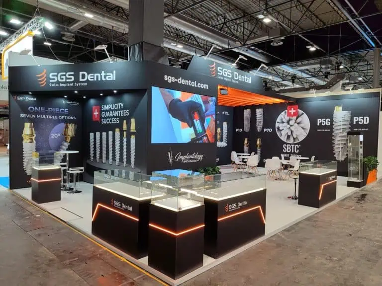
Booth branding is the visual system — logo, headline message, colour and imagery — that tells a passer-by who you are and why they should care, ideally within three seconds. On a crowded floor you are not competing for a considered read; you are competing for a glance. So the first job of branding is altitude: your name and one benefit-led message need to sit above the height of the crowd, typically above 2.5 metres, on a hanging sign, a tall back wall or a tower.
The second job is restraint. A stand that tries to say five things says nothing. Lead with a single headline that states the outcome you deliver, not your tagline or a list of services. Bold colour and clean graphics still dominate high-performing stands — 48% of exhibitors report that eye-catching displays are what draws the most attendees (CEIR, 2024) — but “eye-catching” means high contrast and one focal point, not maximalist clutter. Keep body copy to the absolute minimum a visitor needs while standing.
The third job is consistency. Your stand, your pre-show emails, your staff clothing and your follow-up should look like one brand, because recognition compounds. This is also where strong exhibition stand design earns its keep: a designer who understands sightlines will place your message where the eye lands from the aisle, not where it looks balanced on a flat artwork. If you want worked examples of message hierarchy in action, we publish teardown-style breakdowns in our in-depth guides on Medium.
Traffic flow and zoning: guiding visitors through the stand
Traffic flow is the deliberate design of where visitors enter, what pulls them deeper into the stand, and how they move between functions without bottlenecks. Most stands are designed as a facade and an empty middle; high-performing stands are designed as a journey with a destination. The reliable technique is to place something worth walking to — a live demo, a large screen, a product hero, a coffee point — toward the back, so the open frontage invites the step in and the rear anchor draws people the rest of the way.
Zoning makes that journey legible. Separate the stand into clear functions: an open welcome zone at the edge, an engagement or demo zone in the middle, and a quieter meeting or closing zone to the side or rear. Visitors self-select by intent — browsers stay forward, serious prospects move back — which lets your team read the room and spend time where it converts. Keep internal walkways at least one metre wide so a busy moment does not feel like a scrum.
Flow planning pays off because so much value comes from people you did not expect. Industry data shows 54% of trade-show purchases and follow-up conversations begin with an unplanned booth visit rather than a pre-booked meeting (CEIR, 2024). A stand that makes it easy to wander in, find a reason to stay, and end up in a conversation is simply capturing more of that unplanned demand. For first-time exhibitors especially, this is where a creative exhibition booth concept earns back its cost — by engineering the path, not leaving it to chance.
Technology and interactivity: holding attention and capturing leads
Booth technology is any interactive or digital element — touchscreens, LED walls, product configurators, VR or AR demos, lead-capture apps — used to deepen engagement and record interest. Used well, it turns a passive look into an active session and, critically, into data you can follow up. The principle that separates useful technology from expensive decoration is simple: every interactive element should have a clear purpose and end in a captured lead or a logged interaction.
Interest in interactivity is real — 59% of attendees say they want hands-on demonstrations at stands (CEIR, 2024) — but the technology should match the message, not chase novelty. A configurator that lets a buyer build their own version of your product is worth ten generic looping videos. A large screen showing a clear before-and-after outperforms a wall of rotating logos. If a piece of kit does not help a visitor understand your value or help your team qualify them, cut it and put the budget into layout or branding.
Lead capture is the part exhibitors most often neglect and most regret. Decide before the show how an interaction becomes a record — a badge scan at the demo, a short tablet form in exchange for a result, a QR code that books a follow-up — and make it frictionless. The stands that report strong return on investment are rarely the ones with the most screens; they are the ones where every screen had a next step attached to it.
Lighting, materials and sustainability
Lighting, materials and finish are the elements that make a stand feel considered up close and decide how it photographs for your post-show content. Lighting is the most underrated lever in the hall: directional spots on your product and washed light on your headline wall lift a stand far more cheaply than extra structure. Aim to light your message and your hero items deliberately rather than flooding the whole space evenly, which flattens everything.
Material choices carry your quality signal. Clean joins, solid surfaces and a level floor read as a credible company; flimsy pop-ups and visible cable runs undercut even a strong brand. You do not need premium materials everywhere — concentrate spend on the surfaces visitors touch and stand closest to, and economise where they never get near.
Sustainability has moved from a nice-to-have to a procurement requirement for many exhibitors, and it aligns neatly with cost control. Reusable, modular systems that you re-skin each show cut both waste and repeat build spend, and an increasing number of venues and organisers now ask for evidence of it. Designing for re-use — rather than building bespoke and skipping it after one show — is usually the more economical choice across a season of fairs.
What an effective stand costs (and the hidden costs)
An effective custom stand in Europe typically runs from roughly €180 to €1,100 per square metre, depending on whether it is largely modular or fully bespoke, single or double-deck, and how much technology it carries. That range is wide on purpose: a clean, well-lit modular stand at the lower end will out-perform a cluttered bespoke build at the top end, so spend should follow the element that limits your results, not a per-metre vanity figure.
The bigger risk to your budget is the costs that never appear on the design quote. Plan for these from day one: space-only versus shell-scheme (a space-only plot means you build everything, including walls and floor); electrics and rigging (power drops, connection fees and hanging-sign rigging are billed by the organiser); AV and screen hire; graphics and reprints; furniture hire; storage and drayage (moving materials in and out, often a surprisingly large line); installation and dismantling labour; cleaning, waste and stand insurance; and show-organiser surcharges for late orders. On many projects these together rival the cost of the stand structure itself.
The way to keep the total defensible is to itemise every line before you sign and to design out the avoidable ones. Reusing a modular frame removes repeat structure cost; ordering services early avoids late-order penalties; and getting the design right the first time avoids on-site changes, which are the most expensive money you can spend at a show. For a fuller breakdown with worked examples, see our exhibition stand cost guide (Europe).
Planning timeline and choosing a build partner
The realistic lead time for a custom stand is eight to twelve weeks, and the projects that go smoothly are the ones that respect it. A workable countdown looks like this: at 10–12 weeks out, confirm your space, objectives and budget and brief your designer; at 8 weeks, sign off the 3D concept and layout; at 6 weeks, lock graphics, technology and furniture; at 4 weeks, order all venue services to beat late surcharges; at 2 weeks, confirm logistics and the install and dismantle plan; and in the final week, brief your stand staff on the flow and the lead-capture process. Rushing any of these stages is where avoidable cost and risk enter.
Who builds the stand changes how much of this you have to manage yourself. A subcontracted chain — agency to broker to local builder — adds a markup layer at each handover and slows down fixes, because no single team owns the outcome. A Madrid-based in-house builder who designs, produces and installs under one roof removes those layers: one accountable team, no broker margin, and someone who can solve a problem on the stand the same afternoon rather than emailing it down the chain. For exhibitors at Spanish fairs in particular, that proximity is a direct saving on logistics and a real reduction in risk. You can compare our full service scope under exhibition services, and our weekly notes for exhibitors go out through our Substack newsletter.
Which booth design strategy fits your situation?
The right emphasis among the four elements depends on your budget, experience and goals. Find the scenario closest to yours below.
You are working with a small booth budget
Put almost everything into branding altitude and lighting. The cheapest way to compete on a tight budget is a tall, legible overhead message and well-aimed lights on one hero product — both deliver visibility out of proportion to their cost. Skip custom joinery and bespoke technology; choose a clean modular frame, one strong graphic and a single clear reason to stop.
You are a first-time exhibitor
Prioritise layout and traffic flow, because they are the mistakes first-timers cannot see coming. Keep the frontage open, put one worthwhile thing at the back to draw people in, and agree how your team will capture leads before you arrive. Resist the urge to cram the stand with messaging; first-timers consistently over-fill and under-direct.
You have a small 3×3 metre stand
Design vertically and protect the open floor. On nine square metres, every counter or case you add to the front costs you a visitor, so push storage under a counter or up a back wall and keep the aisle edge clear. One bold overhead brand block and one demo point is more effective than three competing zones.
You are choosing between a B2B tech expo and a consumer show
Match the technology to the audience. At a B2B technology expo, a product configurator or a focused live demo with proper lead capture earns its place because buyers want depth. At a consumer-facing show, the priority shifts to throughput and shareable moments — bold branding, an easy entry, and an experience people will photograph — so design for volume and dwell rather than long one-to-one demos.
Expert tips from the build floor
- Design from above first. Decide your overhead message before anything else — it is the only part of the stand most visitors ever read.
- Walk your own plan. Trace the visitor path on the floor plan with your finger; if there is no obvious place to go, neither will your visitors find one.
- Light the product, not the room. Directional lighting on hero items lifts perceived quality more cheaply than any extra structure.
- Attach a next step to every screen. If a piece of technology does not end in a captured lead, it is decoration.
- Order venue services early. Late orders for power, rigging and furniture carry the steepest avoidable surcharges in the whole budget.
Watch: building exhibition stands that actually perform
This walkthrough covers how layout, branding and flow come together on a real European show floor.
Frequently asked questions
How do I get more people to my booth?
Make your stand readable from across the hall and easy to step into. A tall overhead message with one clear benefit pulls people from a distance, an open frontage removes the barrier to entry, and something worth seeing at the back draws them in. Pre-show marketing helps too — exhibitors who promote their presence beforehand generate 46% more booth visits (CEIR, 2024).
What makes a good exhibition stand?
A good stand is visible from a distance, communicates one clear message in seconds, and makes it physically easy for the right visitor to step in and talk. Layout, branding, traffic flow and technology have to work as one system; a simple stand that nails those basics beats an expensive one that does not.
What are the best booth design ideas on a small budget?
Spend on a tall, legible overhead brand block and directional lighting on one hero product. Both deliver visibility far beyond their cost. Use a clean modular frame, one strong graphic and a single clear reason to stop, and skip bespoke joinery and gadgets you cannot tie to a captured lead.
How much does an exhibition stand cost in Europe?
Custom stands generally run from roughly €180 to €1,100 per square metre, driven by whether the build is modular or fully bespoke, single or double-deck, and how much technology it carries. Budget separately for hidden costs such as electrics, rigging, AV, storage, drayage, installation, dismantling and organiser surcharges, which together can rival the structure cost.
How far in advance should I start planning my stand?
Allow eight to twelve weeks for a custom build. Confirm space and brief at 10–12 weeks, sign off the 3D concept at 8 weeks, lock graphics and technology at 6 weeks, order venue services at 4 weeks, and confirm logistics at 2 weeks. Starting later forces rushed decisions and late-order surcharges.
Is interactive technology worth it on a stand?
Only when it serves the message and ends in a captured lead. 59% of attendees want hands-on demonstrations (CEIR, 2024), so a configurator or focused live demo can be powerful — but looping videos and screens with no call to action are expensive decoration. Match the technology to the audience and attach a next step to each piece.
Recommended reads
- Exhibition stand cost guide (Europe) — what stands really cost and how to plan the budget.
- Exhibition stand design — how a design-led approach turns space into performance.
- Modular stands — reusable systems that cut waste and repeat build cost.
About Adam Expo Stand. Adam Expo Stand is a Madrid-based exhibition stand design and build company serving exhibitors across Europe, with in-house design, production and installation for custom and modular stands at IFEMA Madrid, Fira Barcelona, Messe Frankfurt, ExCeL London and more than 50 European trade fairs each year. Follow our latest work and follow us on LinkedIn for weekly exhibition insights.
Planning a stand for your next European fair?
Tell us your show, your space and your goals, and our Madrid design team will turn the four elements above into a stand built to perform — on a defensible budget.